
Take your art to the next level by imagining a light source and creating some shading in Adobe Photoshop! As a beginning illustrator, it can be daunting to add dimension to your illustrations. However, there is a quick and easy way to begin experimenting with shadows and highlights. Even though it’s very basic, it actually makes a huge difference in the overall quality of the image and can make a quick outline sketch look less flat and more realistic! If you have an illustration that you’ve created with flat colors—which is to say you haven’t already added shading—import it into Adobe Photoshop and follow this tutorial to create some artistic dimension. It works best with black outlines, but feel free to experiment with all kinds of images. Please note that this is not the only way, or the best way, to add shading to an illustration! It’s just a simple method that you might find helpful, especially if you’re just starting out in digital art.
 Look how much better an illustration looks with just simple shadows and highlights!
- Create two layers, one for your shadows and one for your highlights. The order does not matter!
On the “shadows” layer, we will be drawing in black. On the “highlights” layer, we will be drawing in white. I like to use a medium-sized brush with low hardness (around 0%) since my drawing is not very precise and I like the lighting to look soft and natural. At any point, if you’d like to erase a line that you created, just use the eraser tool (with a matching hardness) to remove it.
To make the lighting subtle, we’ll be toning the opacity of these layers down to something lower in a later step. To make your job easier, though, you can choose to draw the shadows and highlights at 100% opacity (completely black and white). Or, if it’s easier to visualize the final product by drawing them on at a lower percentage, you can try doing that too!
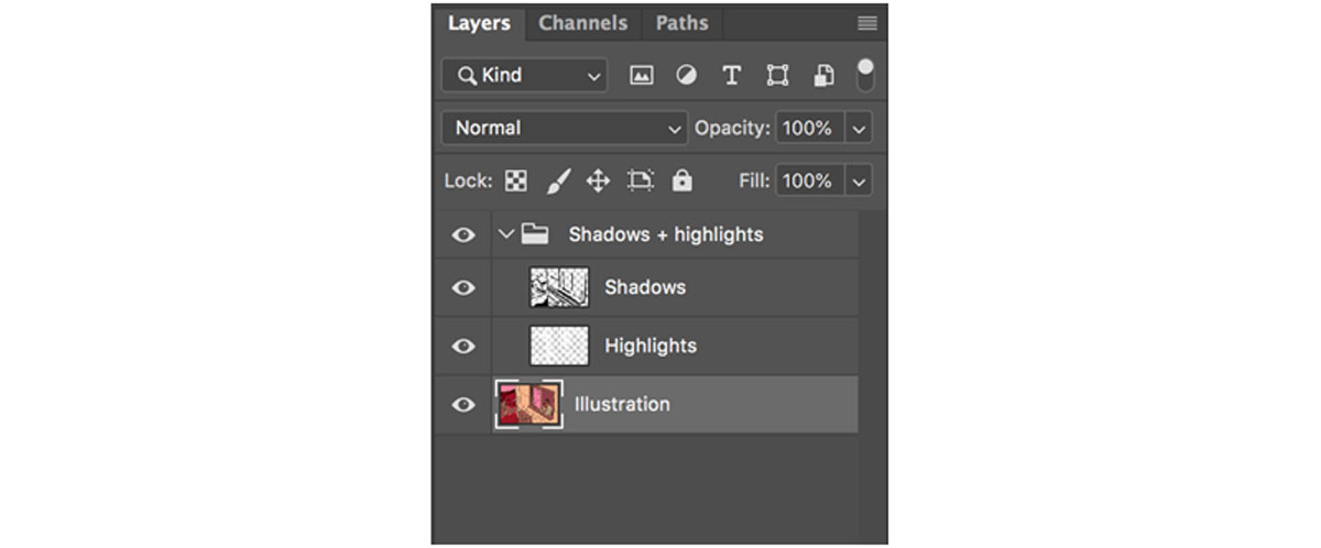 Once you draw both layers, your Photoshop layers might look like this.
 - Determine your light sources and let them direct where you draw your highlights.
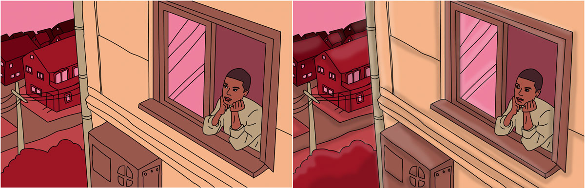
The key to creating realistic lighting is to make it realistic—which means you have to know where the light is coming from, even if it’s not in the picture. For this example, I drew an outdoor scene. I imagined my character looking out a window with the sun off-screen to the top left. Because of this, I knew that the objects would be lit from that direction, so I drew a line of highlight along the top left sides of various objects in the illustration.
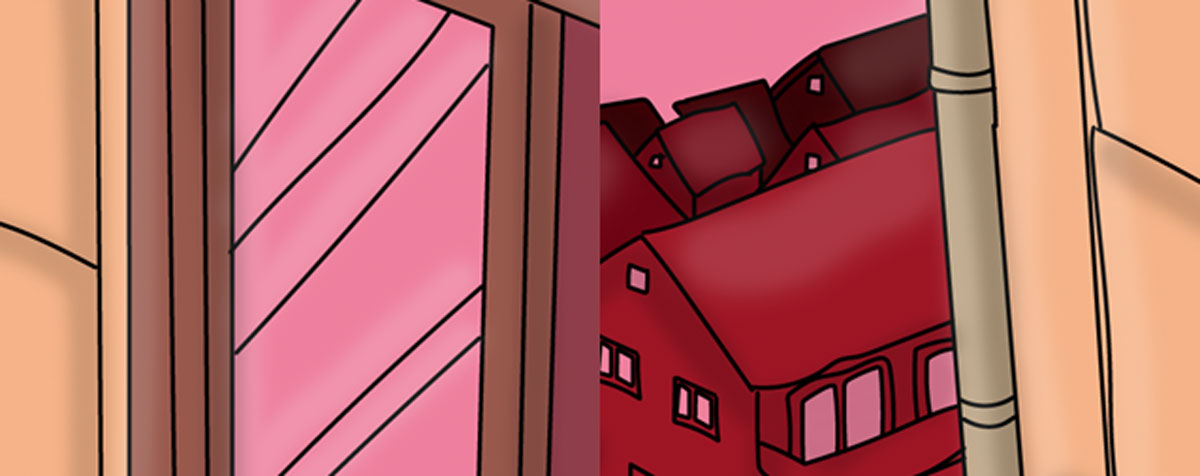 I drew a line of highlight to the top left of all objects, including these creases in the window glass, roofs of neighboring houses, and edges of pipe.
 - Repeat for the shadows.
Using the same technique from the last step, imagine the light source in your image and think about which areas would be cast into darkness. In my example, I imagined the sun in the top left, so as a general rule of thumb, I added a line of shadow to the bottom right of each object in the image.
Remember, your shadows do not just have to be straight lines that follow the outlines of your illustration! Fill in entire areas that would be darker, like the shadow a chin creates on a neck, hair creates on a face, or eyebrows create on eyelids. For nonhuman subjects, think about which objects would create larger sections of shadow too.
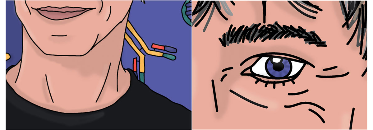 Notice how the neck and eye sockets here have more shading than some of the other areas. Your shadows will be more realistic if they’re not linear!
 - Set both layers to 8-20% opacity.
If you didn’t do this in step one, go ahead and set the entire opacity of each layer. I usually use 10% for highlights and 15% for shadows. If you’re working with darker colors, the highlights will be more dramatic, so you might want to use a lower percentage like 8. On the flipside, if you’re using mostly light colors, the shadows will appear more obvious, so you might want to use a lower percentage for those. (For example, I wish I would have toned down the shadows a bit on the “house” in this tutorial because the light yellow color makes the shadows more dramatic than they appear on the background.)
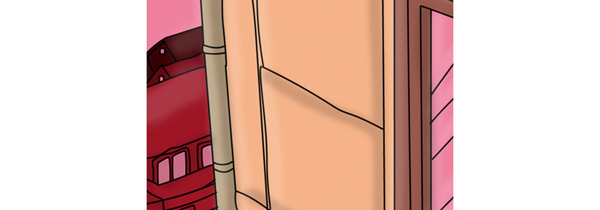 The shadows are more dramatic on light areas, like the yellow house, than they are on dark areas, like the brown window pane.
 - Optional: Create more layers for more intense shadows/highlights. Sometimes, having just one layer of shadows and highlights can make them seem too strong in some areas and too subtle in others. To fix this problem, go ahead and create more layers using the same steps listed above to create darker shadows or brighter highlights in certain areas. By layering multiple shadows and highlights, you can create even more dimension and increasingly realistic shading.
For a more in-depth glimpse into the world of digital artwork, consider watching how Dutch artist Lois van Baarle creates his illustrations in Photoshop. Are you a current student? See how you can save up to 60%.