Creating a clean, professional-looking text animation is actually easy when you break it down into separate effects. Read on to learn how! One of the quickest ways to determine whether a video is professional or amateur is to study the text. How does it animate on- and off-screen? How much space does it take up? Is the text transition quick or does the text seem to hover for too long? Often, basic-looking text or familiar transitions can be reminiscent of iMovie presets. There’s absolutely nothing wrong with using these to create videos for your personal life and school projects—but if you’re trying to elevate a video and create a truly impressive file, creating a snappy text animation is a great place to start. The most impressive text transitions are fast, snappy, and clean. They flash onto the screen so quickly that you barely have time to figure out how each of the various elements got there—which can make the effect look more difficult than it actually is. This tutorial will explain how to create a modern text animation using keyframes in After Effects. You can use text transitions for any type of video. They work well as introductory clips for YouTube channels, overlays in motion reels (a video you create to apply to jobs as a motion designer or animator), or any title sequence for a longer video project. How to Create a Text Animation
- Create your After Effects file and start a new composition. Standard video size is 1920 pixels in width and 1080 pixels in height. For this tutorial’s quick flash of one to three words, you probably won’t need more than five seconds in your composition. Of course, feel free to create something longer if you want a slowed version of this effect. You can always change the length of your composition later by going back into the settings. Select a background color as well. When you export your composition, this background color will not show up. If you want it to, create a solid layer and fill with your desired color! I chose a muted red.
- Create your text.
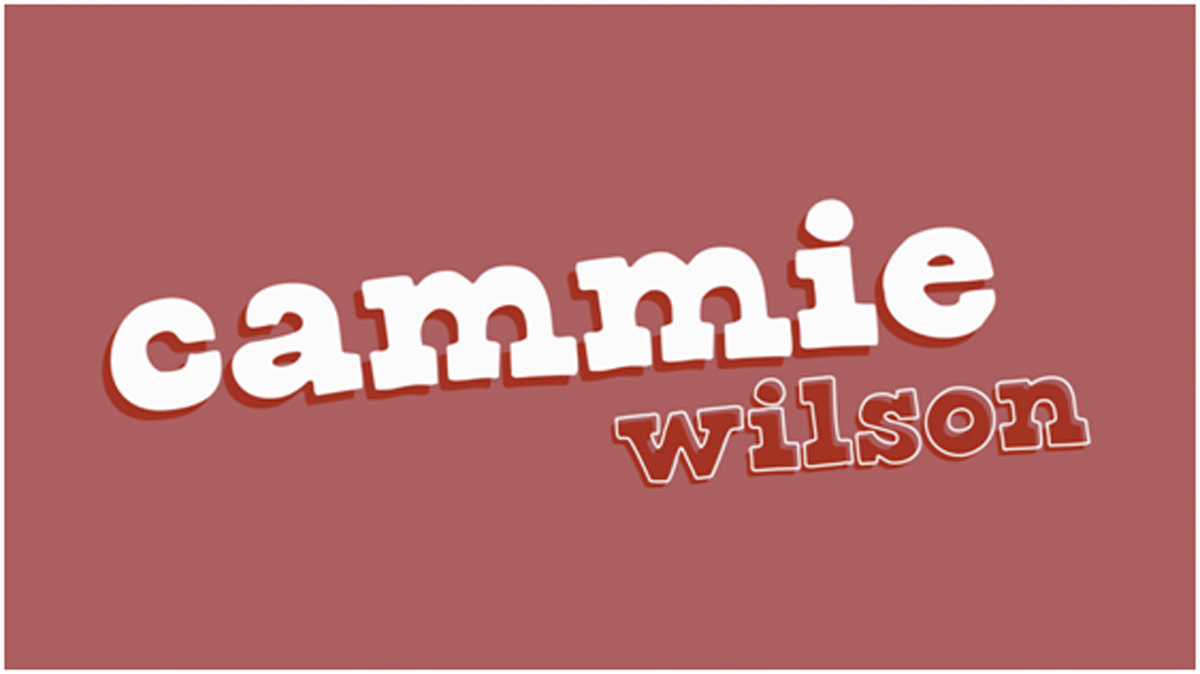
If you don’t know where to start, type out your name! I’m using a fake persona called “Cammie Wilson” and I’m pretending she wants to create an intro video for a personal YouTube series—so the name will be the only thing onscreen.
 For this tutorial, I have two text layers for each word, since I wanted to add a shadow of color behind the words. This is completely optional! I also titled the text using “rotation” in the transform options of the layers.
Next, choose a font. Aim to match the tone of your video or personality. If you’re creating professional assets for yourself, like making portfolio videos or a motion reel, opt for a more serious font. For something more lighthearted, like a personal video series, you can play around with something more nontraditional and fun. (For “Cammie,” I’m using an Adobe font called Corndog.) You can download fonts directly into your creative cloud software by visiting Adobe Fonts. - Start with a simple “on animation”. For a clean animation, you want your text to be off-screen or invisible for the beginning and end of the clip. That means that it will come both on and off of screen during the animation. One of my favorite ways to “animate on” is to start with text that is so small it is imperceptible and increase the size until it is legible, giving the effect that the text “bounces” onto the screen. To do this, all we have to do is set the “scale” of the text to 0 when the video starts and have it increase to 100 a couple seconds in. Simply open the “transform” properties of the text layer in your timeline and click the stopwatch button to create a keyframe. (You only have to press the stopwatch once to make a keyframe. After that, you can press the diamond icon instead.) Put one keyframe at the beginning of the composition and enter the scale as “0”. Move the playhead to 2 seconds and enter the scale as “100.” (If you’re confused, learn more about keyframes here.) Repeat this for all of your text layers. If you want them to appear on-screen in a certain order, move the keyframes of the later object to be a bit delayed. Tip! Want to make your bounce look really cool and snappy? Try adding a keyframe at 1.5 seconds with a 115% scale. This will make the object grow onto the screen and quickly snap back into place, like a ball bouncing onto a table. It’s a subtle edit that can make a big difference!
- Add a secondary effect.
Now that your text comes onto screen, you’ll want to add one more animation to make things really smooth and trick the viewer into thinking it is more complex than it truly is.
 This animation might look complex, but it actually just combines two effects: text tracking and scale.
I like to play with the space between letters for this one. In After Effects, this is called “tracking.” If you type “tracking” into the effects window, you should find two effects called decrease and increase tracking. Either of them will work. Just drag one onto your text layer to begin.
These effects are presets, which means they come with a built-in idea of how it’s going to work. We don’t want that, since we are going to manually input our keyframes! Click the “u” key with your layer selected to make it easier to see the keyframes we’re working with. Delete all of the preset ones that came with “tracking.” Time to make our own! Create a keyframe at 0 seconds for too much tracking—something like 50 or 25. Then, create a keyframe at 2 seconds for 0 tracking (normal). Trouble-shooting: If your composition is too short, there might be preset keyframes lurking after the composition ends. In this case, you might need to add a third keyframe at the end of your composition and input 0 tracking again, just to make sure nothing weird happens. This is what the timeline might look like. There are keyframes for both tracking and scale for all of the text layers. (Notice how some keyframes are hourglass-shaped instead of diamonds. These have an “easy ease” effect applied, which makes the motion smoother. You can right-click the keyframes to apply easy ease if desired.)
 - Make the words “animate off”.
Now that your text comes in in a really snappy way, it’s time to make them leave the screen, too! You can either use the reverse of these two effects by adding keyframes in backwards order (at 3 seconds and 5 seconds instead of 0 and 2)—or create your own.
 To add another layer of complexity, I applied a “typewriter” effect to the last name on this version—but the first name was created using the steps outlined in this tutorial.
For this example, I used the same scale effect, but instead of messing with tracking, I added a twist. For this spinning effect, I set rotation keyframes to 0 and 30, which only completes a slight twist instead of a full, 360-degree spiral. - Adjust timing and play it back! Play your composition back by pressing the spacebar. You might want to make certain things move faster, which you can do by making the keyframes closer together. You might also want to delay your secondary effect, depending on how that looks, so feel free to play around. Once you’re happy with how everything looks, export your composition by rendering it in After Effects or adding it to Adobe Media Encoder. You can learn more about exporting a composition here.
Are you a current student? See how you can save over 60%.


