
Create authentic-looking text that writes itself onto the screen by following this After Effects tutorial. A hand-drawn design aesthetic can make your video text appear trustworthy and personal. If you’re creating a YouTube video introduction, making an animated version of an existing logo, or simply hoping to turn your signature into a name that writes itself, it’s handy to know how to create text that writes on in After Effects. In this example, we’ll be applying the effect to text in a handwritten-style typeface. However, once you know how to follow these steps, you can easily use the same process to draw on any element in a video. You can use it on any font or any doodle with a consistent line width.
- Create your text.
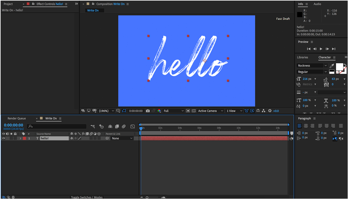
This tutorial will work with any sort of text. You can begin by typing your words in any font, but a typeface reminiscent of handwriting will give the most authentic final result. To do this, click on the text tool (), draw on a large box, and adjust the settings in the character window until you have the desired font, size, and spacing.
For this tutorial, I am using a font called “Rockness” with a size of 200 on a blue canvas that is 540 by 360 px.
- Apply an effect called “stroke”.
In the effects and presets panel, select an effect from the “generate” folder called “stroke.” Drag it to the text layer you created in Step One. (You can learn more about stroke, and the other generate effects, by checking this handy guide.)
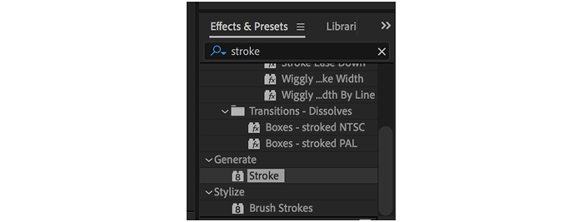 Type “stroke” into the search bar to find it faster.
 - Using the pen tool, create masks in the shape of each letter.
With this same layer selected, click the pen tool and begin drawing lines that follow each segment of the text. If your text is in cursive, it is okay to use one line/mask for the entire word. Work in order from the beginning of the word to the end, making sure to make separate lines for the crosses on T’s and dots on I’s.
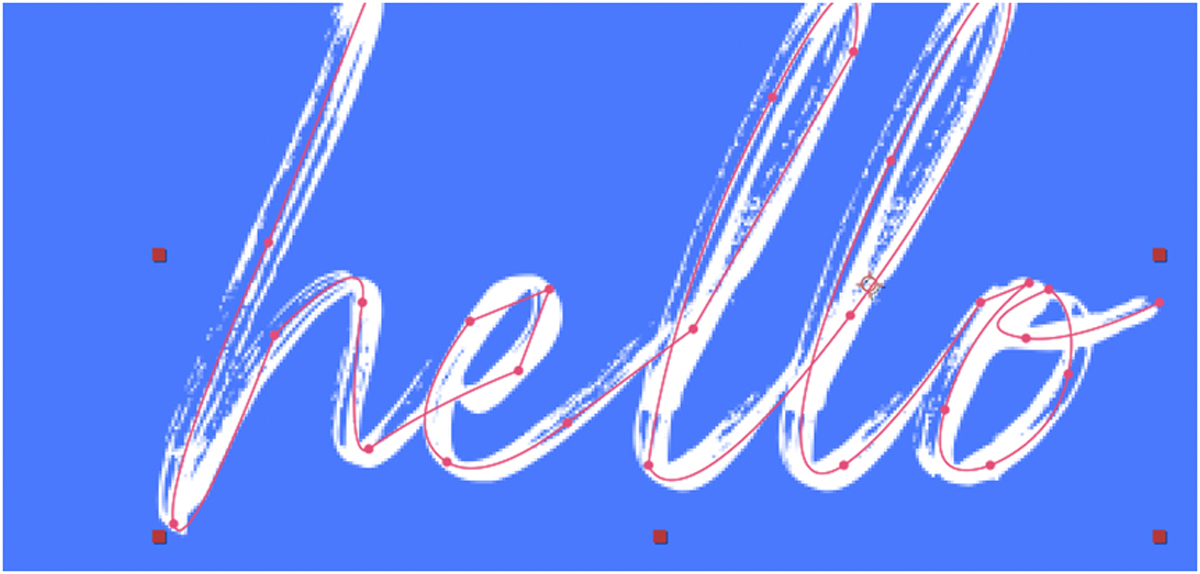 Hold down your cursor to create a curved line, like I did for most of the letters above.
 - Adjust the stroke thickness until the font is covered.
Open the effect panel to see the settings for the stroke effect we applied in Step Two. In this panel, make sure the “all masks” and “stroke sequentially” boxes are checked. Then, select a crazy color for your stroke—this will be invisible, so just choose something that makes it easy to see.
 To make it easier to see, I am using this lime green color as my stroke.
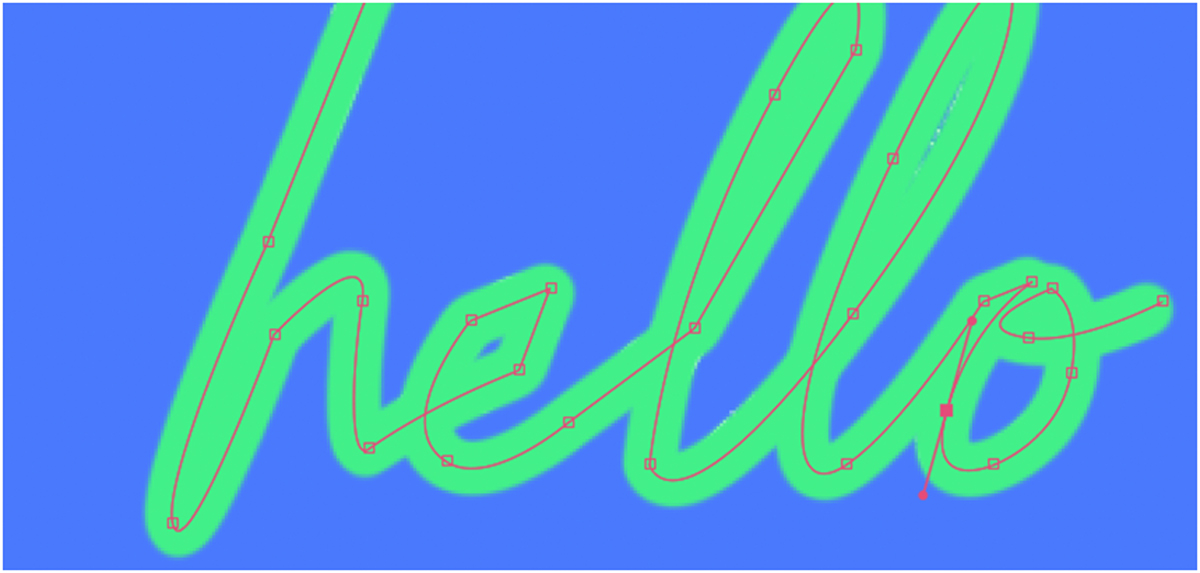 Increase the stroke width until the text is completely covered.
 - Set the paint style to “reveal original image”. Then, add your keyframes.
Once your mask path looks good, change this setting in the effect window. In the timeline, set “End” to 0 and hit the stopwatch. Then, move the playhead to the point in your composition where you would like the text to have completed drawing on. Type “100” into End.
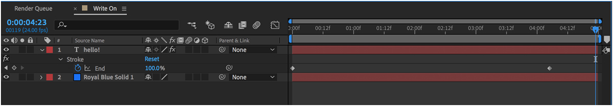 In this example, the drawing begins at the start of the composition and finishes around 4 seconds later.
 - Optional: Edit the paths to remove any unwanted “limbs”. You may notice that letters with intersecting pieces that create tiny bumps I like to call “limbs”. Sometimes, this problem can be fixed by using more accurate masks and a thinner stroke width. If the problem persists, it might be helpful to break problematic letters into separate segments. Convert your text to a .png and save the main stem of the letter from the limb part—for example, separating the cross from the stem of the T or breaking a B into a stick and two bumps. It might be tedious, but for short words that only contain a few letters, the difference is worth the added time.
- You’re done! Write on!
After following these quick steps, you should have completed the tutorial. Drag your playhead to the beginning of the timeline and press the spacebar to preview the animation.
You can create a clean transition by having the text write off, too. If you would like the text to draw off from left to right, use “start” keyframes from 0 to 100. If you would like the text to draw off from right to left, like I do below, use “end” keyframes again in reverse, from 100 to 0.

Though it’s more complicated, you can get this same effect by using a tool called track mattes. Learn how to do it here! Are you a current student? See how you can save up to 60%.